
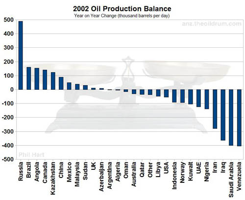
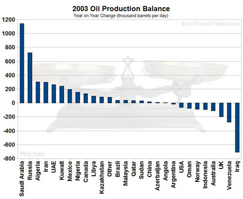
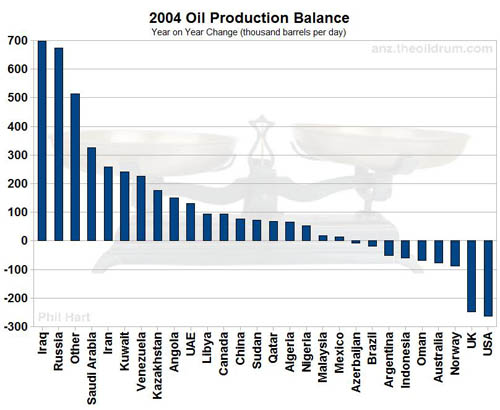
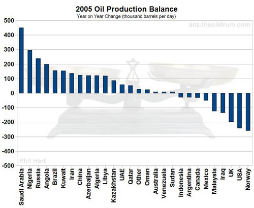
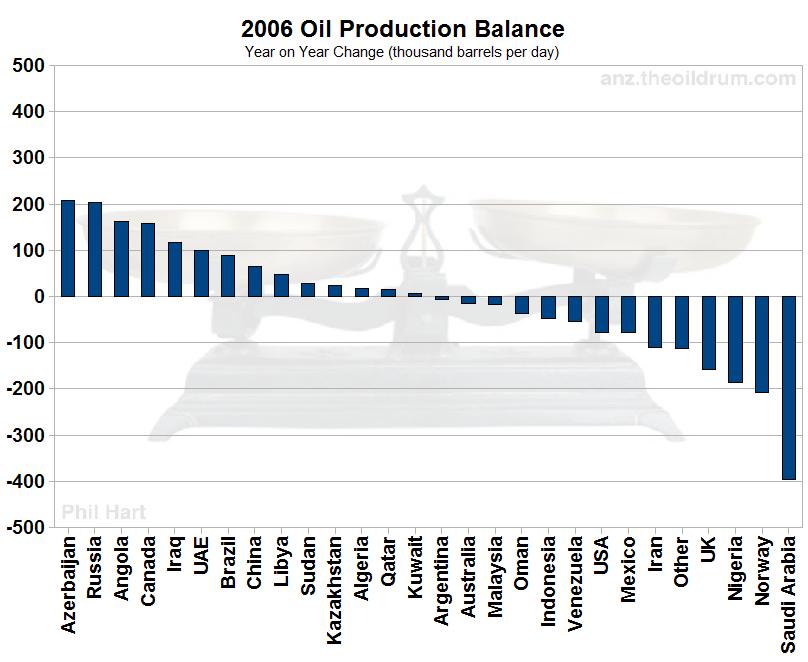
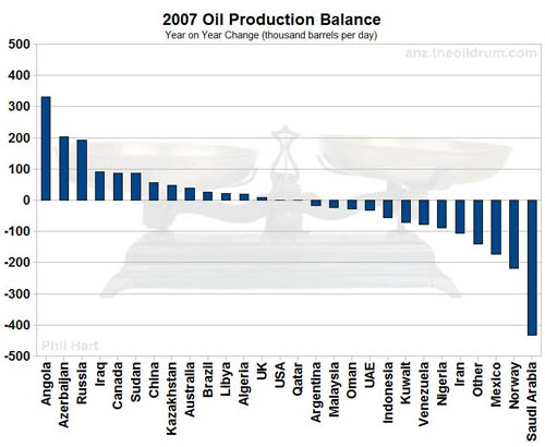
When interpreting those graphs it is good to remember that oil prices were under $30 a barrel until 2003. Then rose every year after that. In 2004, and 2005 the high prices were causing producers to squeeze out all the production they could. However they appear to have stagnated for a couple years. There was a fairly dramatic increase in production at the end of last year(which was only enough to almost counter the low production at the start of the year) however, and the average price for this year is currently over $100. Whether that is enough to drive production to increase when the increases from 2005-2007 were not is anyone's guess.
No, I don't need a new hobby. Yes, I do realize no one has ever posted a comment about my oil statistic rants because no one else in the world stares at graphs for a hobby and therefore they groan and move onto the next blog entry upon seeing a graph with the word oil.
1 comment:
I like how those blue lines stuck in those boxes with words around them change size as I scroll down the page. That was exciting. I scrolled over them three times, it was so exciting. :)
Post a Comment